Colour and Interior Design
When it comes to interior design, colour can be key in making or breaking a space. This is especially important when it comes to choosing colours for a facility’s spaces. No matter how good an interior designer you may have hired, it’s helpful to have a basic understanding of colours and what they can do for your space.
There are two types of colours: warm colours and cool colours. Warm colours, like red, orange and yellow, can energise a space and its occupants. Cool colours such as blue, green and purple generally create quiet, relaxing atmospheres.
While there are no absolute rules when it comes to using colour in interior design, there are some guidelines that can help you create a space that feels cohesive and reflects your home.
Colour Psychology
In interior design, colour psychology is the study of how different colours can be used to create different moods and atmospheres in a space. Hues are carefully chosen in order to evoke certain emotions in people and set a particular tone.
For example, red is often used in restaurants to stimulate the appetite, while blue is often used in bedrooms to promote relaxation.
While there are numerous factors to consider when choosing colours for your home, it’s important to start with a basic understanding of the different effects that colours can have. From there, you can experiment with different combinations to find a scheme that works best for you and your space.
Here is a list of colours and their associated emotions:
Positive Emotions
| Pink | energetic, feminine, love, romance |
| Red | stimulating, energetic, action, drama |
| Orange | joyful, happy, sunny, creative, stimulating |
| Yellow/Gold | optimistic, happy, bright, cheerful, alert, sunny, powerful |
| Green | calming, balanced, harmony, life, freshness, stability, peace |
| Blue-Green | serenity, tranquillity, softness |
| Purple | power, luxury, elegance, creative |
| Grey/Silver | glamorous, prestigious, sophisticated |
| Black | strong, elegant, formal, mysterious |
| White | light, innocent, cool, clean |
| Brown | safe, secure, comforting |
Negative Emotions
| Pink | immature, girly |
| Red | irritable, angry |
| Orange | pessimistic, hyperactive, superficial |
| Yellow/Gold | tough to get a good shade of yellow |
| Green | ambition, greed, jealousy |
| Blue-Green | impractical, idealistic |
| Purple | sad feelings, frustration,immaturity |
| Grey/Silver | emotional, sensitive, mysterious |
| Black | fear, grief |
| White | sterile, associated with hospitals |
| Brown | restrictive, barren |
Colour Theory
In interior design, colour theory is the practice of using colours to create a visually appealing interface. By following colour theory guidelines, designers can create schemes that are both aesthetically pleasing and easy for users to understand.
When you’re decorating your home, it is important to think about the colours as well as how they will coordinate with other aspects of design in order for them not only to look good but also feel like a natural extension.
The right colour can change everything – from moods and thoughts at night upward direction during daylight hours! It’s crucial that these decisions be made together so every aspect feels cohesive without being too matchy-matchy which might make some spaces seem similarly repeated throughout different areas instead here are just a few examples:
The colour wheel

The colour wheel is important for understanding colour schemes. It has twelve colours on it, which are made up of primary, secondary and tertiary colours.
The secret to creating a great colour scheme that you’ll love is understanding how to use the colour wheel. By combining colours that are opposite of each other on the wheel, you’ll create a colour palette that is easy on the eyes and looks great together.
Red, yellow, and blue is the primary colours. They are the three pigment colours that cannot be made by mixing any other colours. These three colours are mixed to create all other colours and can be combined with white or black to create tints (lighter tones) and shades (darker hues) of these colours.
The three secondary colours, orange, green and violet, are created by mixing two primaries together.
Tertiary colours on the other hand are created by mixing a primary colour with a secondary colour that is adjacent to it on the colour wheel. The tertiary colours are yellow-orange, red-orange, red-violet, blue-violet, blue-green and yellow-green.
To create lighter and darker versions of a basic colour, simply combine it with a neutral colour. This results in different shades, tint and tone.
Colour Scheme
When it comes to interior design, the colour scheme is all about the colours that are chosen and how they are combined. These choices can influence how someone experiences a room.
The 6 types of colour scheme
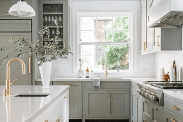
Monochromatic colour scheme – This colour scheme uses any one colour and all of its shades, tints, or tones. This scheme is very easy to implement and can be a great place to start if you are unsure of yourself and your colour choice, or if you prefer a more subdued and subtle look.

photo by zena_oconnor
Analogous colour scheme – involves three colours that are positioned next to each other on the colour wheel. These colours can be mixed with neutrals, but two of the shades involved will be a primary colour.

photo by elledecor
Complementary colour scheme – The two colours that are directly opposite each other on the wheel are called complementary colours. For example, yellow and purple, or orange and blue. When using these colours, select black or white for an accent colour.

photo by elledecor
Split-complementary colour scheme – involves the use of three colours. Start with one colour, find its complement and then use the two colours on either side of it. For example, the complement of blue-green is red-orange and the split complement of blue-green would be red and orange.

photo by @leejofa
Triadic colour scheme – a unique variant of the split complementary colour scheme, with colours that are evenly spaced on the colour wheel. This type of colour scheme is often considered to be more balanced and pleasing to the eye than other colour combinations.

photo by Architectural Digest
Tetradic colour scheme – is a variant of the twin colour scheme in which all four colours are evenly spaced around the colour wheel. This results in no clear dominant colour, making it an outstanding choice for a range of design projects.

photo by colosexplained